Longstanding orchestra modernizes brand to broaden reach
The organisation long known as the Hamilton Philharmonic Orchestra has announced a significant visual and naming refresh, adopting the shorter, more contemporary title Hamilton Phil. The change is presented as a way to honour the ensemble’s 140-year legacy in the city while offering a bolder, more flexible visual identity for future seasons.
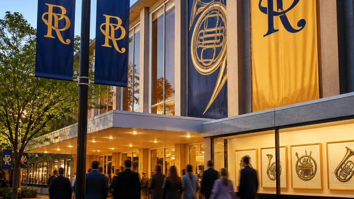
The new mark is centred on an interlocking HP Monogram whose linework forms the initials H and P; an outer edge of the monogram subtly suggests the shape of a brass horn. According to the organisation, the logo draws inspiration from historical horn illustrations used by the orchestra in the 1964–65 and 1970–71 seasons, reinterpreting that visual heritage through a contemporary lens.
“We’re proud to introduce the new Hamilton Phil visual identity. We have a remarkable history in this city, and this refresh celebrates that while creating a brand that feels energetic, welcoming, and relevant to the audiences we serve today,” said Executive Director Kim Varian.
The rebrand is being positioned not merely as a cosmetic update but as part of a broader effort to present the orchestra in a way that can adapt across platforms and contexts. In its release, the organisation emphasised that the new identity is intended to be "distinctive and flexible," supporting the ensemble’s future programming, partnerships and community work.
Local arts observers say visual identity changes can have practical implications beyond aesthetic preference. A refreshed brand can affect wayfinding, marketing, merchandise and donor communications, and it can help the organisation reach younger or more diverse audiences without abandoning long-time patrons who value the orchestra’s history.
- Heritage: The new logo explicitly references mid-century horn illustrations from the orchestra’s archive.
- Visibility: A shorter name and monogram are designed to work on digital platforms, signage and promotional materials.
- Community reach: Leadership says the change is meant to support stronger connections through music across Hamilton.
City arts stakeholders will be watching how the new identity is rolled out across season materials, community engagement and fundraising. A visual refresh can be a visible sign of institutional renewal, but it also brings practical questions about updating printed materials, websites and sponsorship assets—work that requires investment in time and money.
| Item | Detail |
|---|---|
| Founded | 140 years (organisation described as 140-year-old) |
| New name | Hamilton Phil |
| Logo inspiration | Horn illustrations from 1964–65 and 1970–71 seasons |
| Executive Director | Kim Varian |
For Hamilton residents, the refresh is a reminder of the orchestra’s enduring presence in the city’s cultural life and an invitation to see how a historic institution adapts to contemporary expectations. Whether the new identity results in measurable gains in audience diversity, sponsorship or community programming will become clearer as Hamilton Phil applies the brand across its operations and season activities.
As the organisation rolls out the new visuals and name, patrons and partners can expect to see the HP Monogram in promotional materials and at events. The announcement frames the change as both a nod to the past and a step toward a more flexible future for one of Hamilton’s longest-running musical institutions.